Jamaal's Group of Companies
A redesign for one industrial company became a full identity system for the group — five coordinated brands built on a single shared monogram, for a diversified business in Trinidad & Tobago.
Overview
One redesign that earned four more.
Jamaal's Group of Companies Ltd. has operated out of San Juan, Trinidad & Tobago since 2010 — a diversified group spanning construction, transport, equipment rentals, hardware supply and real estate, delivered under one point of contact.
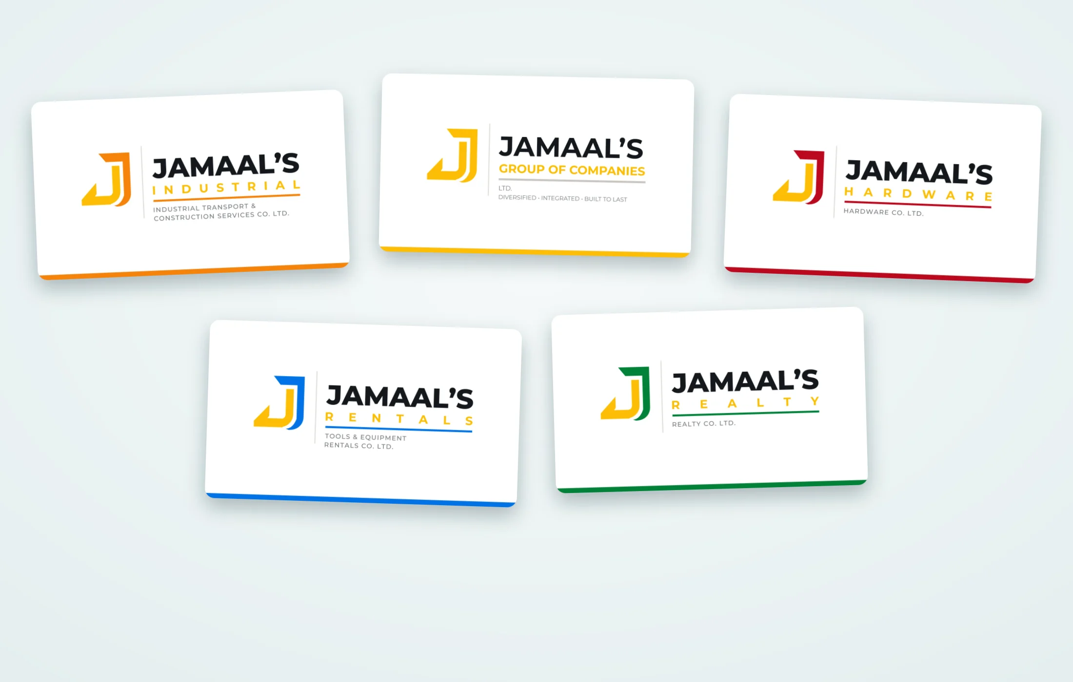
The brief started small: redesign the identity for the industrial arm. That mark landed, and the question changed — if one company could look this considered, could the whole group? We designed the remaining four identities as a single system, so each business stands on its own while reading unmistakably as part of the group.


Five trades. One family.
Colour tells them apart.





- One fixed wordmark structure — family name, division, rule, legal descriptor.
- Group yellow never moves; a second colour codes each division.
- Built to survive signage, vehicles, workwear, print and screen.
The system
One monogram, five identities.
The parent brand sets the pattern; each division inherits it and takes a colour of its own. Pick one to see its full identity.

Jamaal's Group of Companies Ltd.
The parent mark — group yellow, and the structure every division follows. Diversified, integrated, built to last.
Hover or tap the card to see the back.
Jamaal's Industrial Transport & Construction Services Co. Ltd.
Heavy transport, earthworks and civil construction — the company the redesign started with.
Hover or tap the card to see the back.

Jamaal's Hardware Co. Ltd.
Building materials, fixings and safety gear over the counter.
Hover or tap the card to see the back.

Jamaal's Tools & Equipment Rentals Co. Ltd.
Plant, power tools and access equipment for hire.
Hover or tap the card to see the back.

Jamaal's Realty Co. Ltd.
Commercial and residential property — sales and rentals.
Hover or tap the card to see the back.
In use
Built to work off the screen.
Each identity shipped with the print and social assets the businesses actually need day to day.
Outcome
What the client walked away with.
A brand that can add the next company without starting over.
One recognisable family
Five businesses that read as one group on a job site, a business card or a storefront.
Room to grow
The system is a rule, not a one-off — a sixth company slots in with a new colour.
Every file they need
Vector and raster, colour and mono, screen and print — supplied and ready to hand out.
Need a brand that holds together?
Whether it is one logo or a group of companies, tell us what you are building and who it is for.